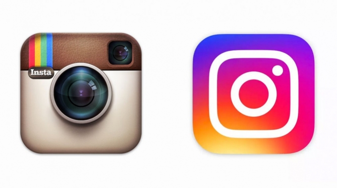
If the Internet were a professional wrestler, its signature move would be the Overreaction. And so, much as we demand progress, changes to something as seemingly unimportant as an app’s logo can nevertheless produce online what the New York Times called “The Great Instagram Logo Freakout of 2016.”
Instagram unveiled its new logo featuring the “flat” design that is the hallmark of iOS on Wednesday. According to Instagram, “the simpler design puts more focus on your photos and videos without changing how you navigate the app, our updated look reflects how vibrant and diverse your storytelling has become.”
Unfortunately for Instagram, as the Times notes, “the people of the Internet were not buying it. Memes were deployed.”
How the new Instagram icon was made. pic.twitter.com/GnivZv81pW
— Oliur (@UltraLinx) May 11, 2016
But how do you separate the noise on the internet reaction from the true signal of public opinion? One way would be to ask a Swarm Intelligence to find consensus in real-time. By thinking together as a swarm, the participants would arrive at the answer that maximized the conviction of the group. So, our researchers asked the members of the UNU community a simple question: Which Instagram logo do you prefer: new or old?

Hey, Instagram, are you listening? The Swarm has spoken…and it prefers the old logo. Time will tell if, like GAP and Coca Cola before it, the photo-sharing app quickly reverts to its iconic original design.
We’d love to have you in the swarm. Sign up to be a BETA USER below:


