Swarm amplifies the insights of human groups, enabling significantly more accurate evaluations, assessments, decisions, and forecasts. In addition, the Swarm platform includes extensive visualization and analysis tools that allow users to review the results of every question asked and better understand why the swarm reached the solutions that it did. In the paragraphs below we feature some of the more popular visualization and analysis features.
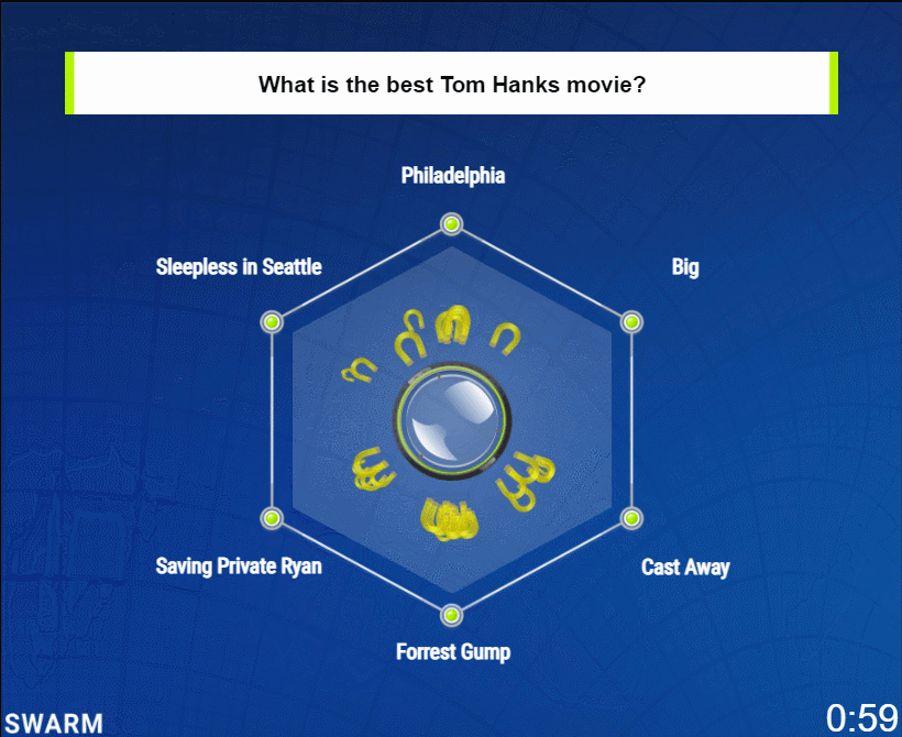
Swarm Replays – a replay is an animated replay of the swarm’s deliberation as it answers the question. All magnets are shown in the replay regardless of the magnet visibility setting when the question was asked. If you participated in the deliberation, the magnet you controlled will appear as green. The replay can be downloaded as an animated GIF.
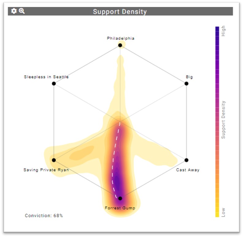
Support Density Charts – the support density chart visualizes the amount of support each answer received during the swarm’s deliberation on the question, expressed in the style of a heat map. The dashed line indicates the path the puck took during the deliberation. If the question had “Ordered Answers”, the Interpolated Solution will be represented on the chart, as well.
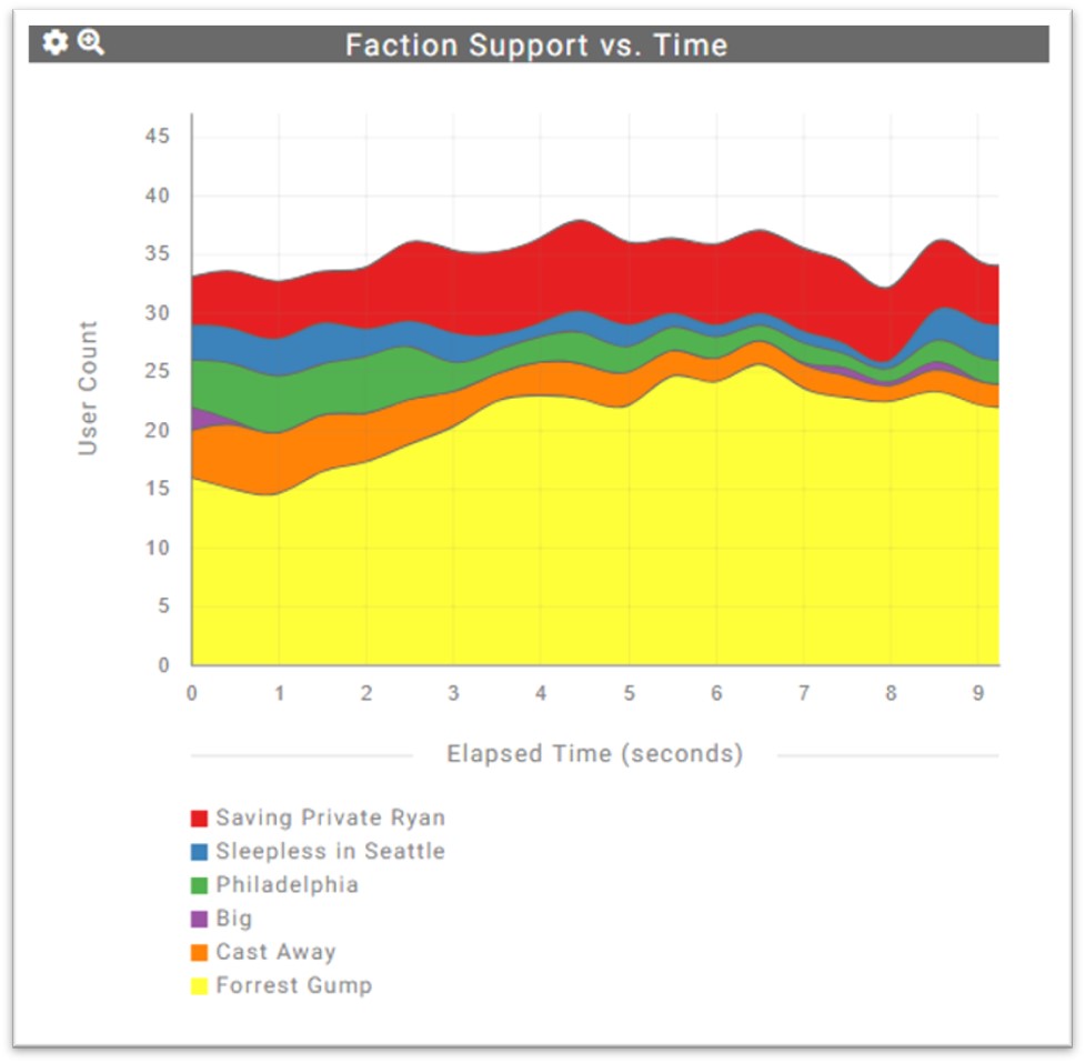
Faction Support vs. Time – this chart depicts the amount of support each answer received over time. The chart shows Faction Support expressed as the number of swarm participants pulling for each option. In the example below, “Forrest Gump” received consideration from 16 participants at the start to over 20 when the swarm completed its deliberation, nine seconds later. The chart can also be configured to display Faction Support as percentages.
 .
.
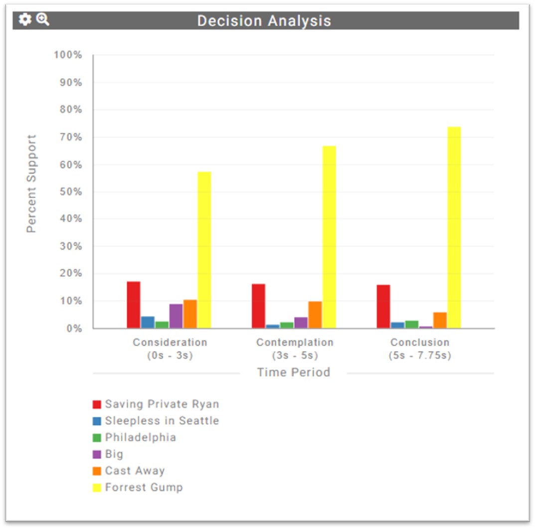
Decision Analysis Chart – this is a simple but informative bar chart that displays the amount of support committed to each answer choice during three phases of the deliberation process. This chart provides a convenient means for examining how support for choices changed during deliberation.
 .
.
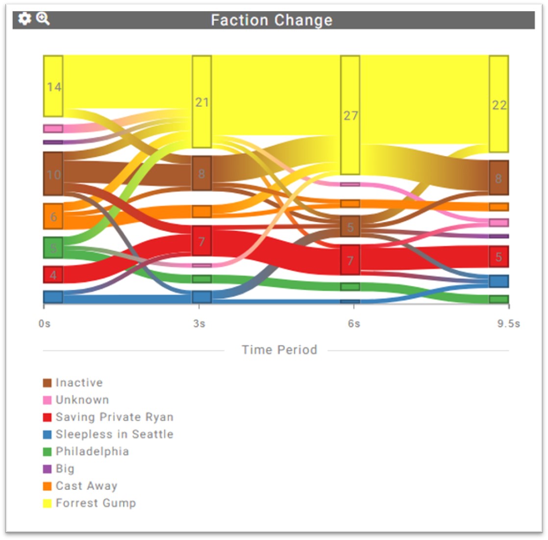
The Faction Change Chart – this powerful visualization shows how support for each answer option (i.e., “factions”) changes during the deliberation time. Mousing over the strands of the Sankey chart displays the number of people that shifted between the two answer options. The number in box indicates the number of participants supporting that answer at that time period. The chart is divided into equal time segments.
 .
.
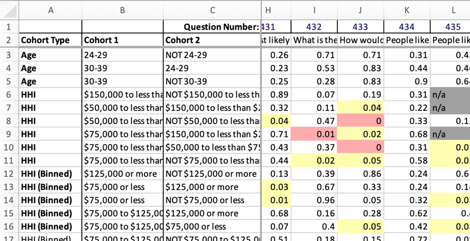
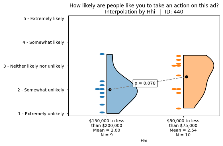
Cohort Behavior Analysis – this advanced feature examines the deliberation behaviors of identified populations of swarm participants and identifies statistically significant differences in response behaviors. Similar to a cross-tab analysis in survey research, CBA looks across all questions in a Swarm session, speeding analysis and review. The output includes:
Summary Report for rapid review of statistical differences.
Data Visualizations for response distributions.
Data Visualizations for response distributions.
Unanimous AI is a proud recipient of research funding from the National Science Foundation.